
Calling Good Design a Spade
Will Bryant’s exhibition, Outta Shape at Companion Gallery is an exuberant spectacle of wacky shapes in fun blues, pinks and yellows. Bryant’s coevals will recognize the vocabulary of zany squiggles and pastels at play as being “so eighties” though they may be less familiar with the Memphis Design group (of Milan, not Tenessee) who established this style. Incidentally, Bryant may also be unfamiliar with the history, but he’s clearly aware of the current trendiness of the style. Playful and not particularly self-aware, the works Bounce! Kaboing! Zip! Blat! and Thunk! around the space like an imitation Mark Applebaum song. It’s all great design but unfortunately for those with a discerning eye, good design is not the same thing as good art.
To be sure, there is overlap between the fields-artists use design and designers use art-but the fundamental difference is the initial impetus for creation. Good art seeks to ask questions, spark conversations, inspire and explore. On the other hand, good design seeks to answer a question, solve a problem or communicate an idea. Both fields utilize creativity and what’s more, thoughtful design can be more artful than much fine art. However, those who approach Outta Shape with an interest in being intrigued, challenged by tough questions, or inspired to explore an idea from a different perspective will be left disappointed and possibly dismayed. At first I gave Bryant the benefit of the doubt. After struggling for too long to tease out a meaning, a big idea, or even a reason for the works to have been created, I gave up. Was there something I wasn’t getting?
Bryant seems to want to shout “Try new things! Be silly! Break the rules!” Meanwhile, the works themselves follow every rule in the graphic designer’s handbook. Each work is balanced and features an appealing palate that either coordinates with or exactly matches its neighbors. The paintings are hung all catawampus but the balance and spacing of the works reveal the effort made to ensure that no two works are hung too close or at too kooky an angle. In taking a principle of good clean fun to the extreme, at least two paintings (that I could find) sit on a ledge atop the gallery walls.
Like variations of a company logo, the same squiggles, dashes and dots of the paintings make their appearance in sculptural form. Six of Bryant’s sculptures are mounted on heavy wire stands reminiscent of cafe table numbers; this presentation reinforces the two dimensionality of the sculptures. Flat-faced, they greet the arriving viewer and give the impression of cartoon elements brought to life. Wall-mounted sculptures serve either to break the frame of their color-coordinated paintings or to accessorize them. Many of the works are spackled with paint like thickly laid icing or drizzled and dripped with coordinating colors. Even though he dabbles in texture and form here, Bryant refuses to truly break into three dimensionality. Again, making it clear how very much he clings to his graphic designer’s tools which do not work so cleanly in the third dimension. Together, the works look more like a company branding guide than an art exhibition. Predictably, a few sculptures also made their way up to that ledge.
Bryant is a graphic designer by trade and his design work can be found in print media, apparel, textiles, consumer products and, disconcertingly, in Outta Shape. In his works, the textural elements serve only to reinforce the visual narrative that this “fine art” not just Adobe Illustrator files to be proofed and printed in a magazine ad for sneakers. Because Bryant is such a good designer, this pell-mell exhibition is carefully composed to be visually appealing and, most of all, palatable. It is easy to imagine the patterns in these paintings for sale on bedspreads and T-shirts at Urban Outfitters. It is not easy to imagine them meaning much else.
Through his design of this exhibition Bryant seeks to communicate the idea that this is an art show. He is unsuccessful. Through Outta Shape, he seeks to persuade that good design can be substituted for good art but he simply doesn’t demonstrate that fact here. Good art is an opening up, while good design tends toward a narrowing down. If a design is misinterpreted, it has failed to communicate its message. If a work of art has multiple interpretations, it has touched many people in different ways. This is what makes Outta Shape so uninterpretable, it’s designed to be a stand-in or facsimile of a convincing art exhibition.
That easy-to-consume, candy-colored, pleasing and sedating design should insinuate itself into an art space without being honest about its intention or identifying itself feels ignorant if not insidious. Such an act undermines the important, thoughtful, and inspirational work that comes from a mindful artistic practice by implying that such a practice can simply be replaced by or equivocated with good design. I would like to warn Austin’s overlapping, interconnected and intelligent art and design communities against this sort of thinking and ask that a more critical and conscientious approach be taken in the display of works.
Before I’m accused of being a curmudgeon, I’d like to make it clear that I don’t hate design. Bryant’s design work, both here and elsewhere, is very good. The thing is, good design in the real world of industry is generally to be admired for its ability to communicate a message or deliver on some purpose while also addressing constraints such as limitations on ad space, printer capacity and budget. In the space of an art exhibition, those constraints are removed and the artist/designer is free to make any creative choice s/he can reasonably execute. With the practical constraints of economics or function removed, good design loses its appeal and becomes uninteresting. A more appropriate show would have featured Bryant’s commercial work and would have framed itself as a design show. This approach would have circumvented the issue of muddying the waters of art and design and would have likely made for singular exhibition for Austin’s small gallery scene.
-Kate Moon
(1023)


 Antechamber, 2016
 Untitled, 2016
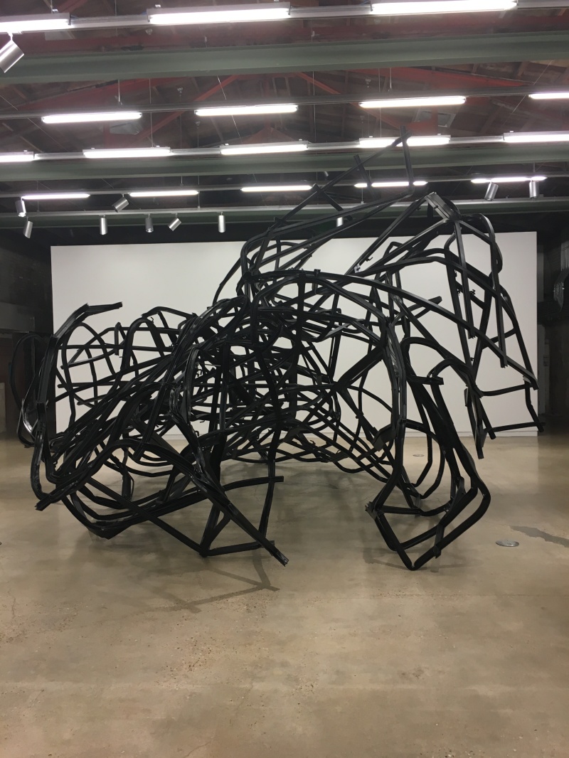
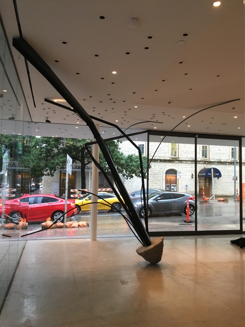 Untitled, 2015

 Façade, 2016
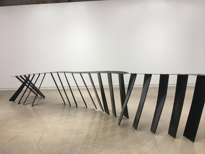 Stairs, 2016
