
Big Medium Gallery, Jonathan Faber’s exhibition Material
Courtesy of BigMedium Gallery
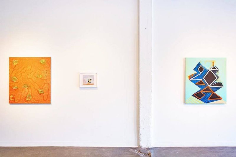
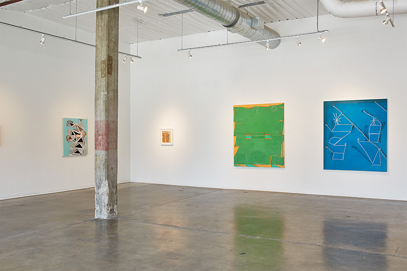
Jonathan Faber’s solo exhibition, Material at Austin’s Big Medium Gallery presents an array of vibrantly colored, large scale oil/acrylic paintings accompanied by smaller chalk pastel drawings. All the works convey a sense of playfulness through a repetition of geometric shapes, vivid shades of blues, pinks and oranges. Faber’s work allowed the artist’s hand to be evident as well as the materials utilized. It shows that the materials used to build the work are equally important as the finished work. Out of the works in the exhibition, three struck me the most; Relic Remix,2015, Open Channel, 2016, Internal Exile,2016. I feel these specific works encompass the style and tone of the exhibition and artist.
Courtesy of BigMedium Gallery
As I moved through each work, I gravitated toward the works that included a totemic arrangement of triangles against a vibrant aqua blue background. The totemic arrangement of triangles serves as a motif throughout Faber’s work. I found it interesting how similar each of these works were to one another but at the same time carry a different tone ranging from playful to ominous to a sense of vulnerability. The exhibition was arranged in a strategic manner, as previously said the show consists of oil/acrylic paintings and smaller chalk pastel drawings. However not every large-scale painting was placed alongside a drawing. The drawings seemed to serve as a sort of breaker between the paintings especially between the ones that had a similar arrangement and color scheme. I found this to be very beneficial to how the work is viewed, so that it did not feel like work was being repeated. For example, the works Relic Remix and Open Channel, have a very similar arrangement of triangles put up against an aqua blue background the two are placed across from one another, one on the right wall and one on the left. The work Open Channel is on a wall with three other works, one of them being the chalk drawing Internal Exile, this is done throughout the show. The way the works are arranged in the show was overall quite balanced, some walls I feel could have been arranged different spatially specifically the right wall. I found the that the way the works are spaced is awkward, each of the works on this wall varied in size and spacing was inconsistent.
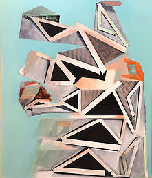
Relic Remix, 2015, Oil on Canvas, 40”x 34”
On the left wall, the work, Relic Remix, contains these visual illusions; playing with the perception of space and depth. The use of shadow and spatial play, caused by the gradient gray patches lying alongside the bold white lines of triangles formed by the removal of tape. On the right wall holds Open Channel, the more ominous version of Relic Remix, this work while having similar arrangement, has a darker color scheme, veering away from this landscape feel to an almost intergalactic feel. The way the totemic-like subjects was placed onto the turquoise background both reminds me of a still-life and gives the illusion that it was pasted onto the background because of his use of shadow and spatial play. The chalk pastel work Internal Exile, was a hushed more reclusive version of his large-scale triangle still lives.
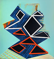
Open Channel, 2016, Oil and Acrylic on Canvas, 40”x 36”
Faber did not want it to merely just be a part of the construction but, later play the role of an active participant in the painting to help both bring in the viewer and distance them simultaneously. The tape and its removal serve as vocabulary for the piece contributing to this sense of an internal dialogue. The removal of the tape is not clean and precise which is essential to maintaining playfulness. For instance, some do not enclose all the way, varying from little slivers of space to one side completely missing but causing me to still see it as a triangle enclosing it myself, forgetting about the opening.
Although the works are abstract, the names of the works are thought out and help to convey and bring meaning to the work to help to better interpret the works, this is appreciated because he could have easily title each work untitled with a vague subtitle. The name Relic Remix helped me to be able to interpret the painting differently, possibly the way Faber intended. The name itself is symbolic, specifically the word “Relic”, in both religious and everyday context refers to an object of sentimental and historical interest, in this case pertaining personally to Faber. With the word “Remix”, Faber may have wanted to alter the viewer’s idea of what a relic is or more so, what it can be. Since Faber draws from his own past experiences and domestic settings of places he once lived that, Relic Remix, may symbolize something that he views personally as a “Relic”. However, the titles of the works are not placed alongside in a wall text, which is often distracting to the work and hinders initial thoughts of a work. There was a pamphlet with the works and titles included but it had to be sought out and was optional at that. I prefer to take one as I exit the show or look them up later to clarify meaning.
This exhibition is all about the process being shown in the completed works and the materials used such as tape, down to the brushstrokes. Faber’s overall approach to painting is reminiscent to Georges Braque’s analytic cubist works and William de Kooning’s use of color playful works thus merging structural and gestural. The arrangement of the works and the space at times challenge and distract from the works. The works in the exhibition were strong and were over all cohesive. Although Faber draws from memories of past domestic settings and everyday objects they are heavily abstracted, causing me to refer to my own memories of both places and objects, perhaps that is the goal. (1000)
-Kiana Long
